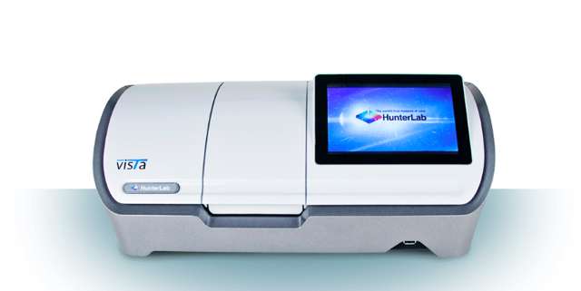
About
BLOG

Interested in a little light reading?

Our blog is continually updated with helpful educational information, advises, research and insights—all in the name of helping you level-up your color and appearance needs. Grab a drink and enjoy our stories!

Explore stories

"Recognizing the Importance of Color in Packaging Sets Your Brand up for Success"

Read

Explore Our Products

View More

"Do you have a formula to convert Hunter Lab values to CIE L*a*b*?"

Read

"How Spectrophotometers Have Made the Visual Color Standards Reference Chart Obsolete for Potato Chip"

Read

"Spectrophotometry Ensures Consistent Mortar Coloration"

Read

"Using Hitch Standardization to Ensure Color Consistency Across Pharmaceutical Manufacturing Sites"

Read

"Using Spectrophotometers to Create Consistency in Colored Contact Lenses"

Read

"What Is the Best Way to Measure the Color of Citrus Juice?"

Read

Recognizing the Importance of Color in Packaging Sets Your Brand up for Success

Posted on Feb 11, 2026 by HunterLab

Apple’s distinctive boxes serve as a prime example of the importance of color in packaging. Image Source: Flickr user Brett Jordan

One of the most widespread concepts in business is the seven-second rule — people make vital decisions within the first seven seconds of encountering a product, and what happens in that time can either nurture long-term consumer loyalty or turn would-be customers off for good.

However, most consumers’ first contact isn’t with the product, but with its packaging. This element is vital to differentiating your brand and its offerings.

For example, many more people would likely recognize the signature blue of a Tiffany & Co. box than the jewelry it may contain. As such, packaging design is often just as important as the product design, shaping consumer perception from the first touch point. With more products than ever competing for space in the marketplace, smart packaging design choices can be the deciding factor in product success, and spectrophotometric analysis helps ensure that your vision becomes reality.

Harnessing the Power of Color in Packaging

Packaging color choice isn’t arbitrary, and it goes beyond simply selecting an aesthetically pleasing color. Instead, designers must draw on both deeply ingrained color psychology and a preexisting visual lexicon of product associations to create packaging that speaks to the consumer in a language they understand.

Brands use colors to project a specific message. For instance, soft drink brands typically use blue for low-sugar options, green for lemon-lime flavors, and red for cola. Similarly, consumers associate green with pine scent in household cleaners and yellow with citrusy aromas in dishwashing detergent. Packaging also shapes consumer choices in prescription drugs, where it can influence perceptions of quality and performance.

Yet, it's essential to remember how these conceptions can shift over time. The sleek, minimalist, white packaging of Apple products is one that brands often shunned before because it was associated with store-brand or “generic” offerings. It's therefore possible to redefine these perceptions while simultaneously becoming defined by specific color choices.

Posted in Color Measurement

Do you have a formula to convert Hunter Lab values to CIE L*a*b*?

Posted on Feb 10, 2026 by HunterLab

Enter Standard Data window

FAQ: “Do you have a formula to calculate Hunter L, a, b values from CIE L*, a*, b* values?”

The only way to convert between different color scales, illuminants, and observers is to have spectral data for your  samples.

All Hunter L, a, b and CIE L*, a*, b* values are calculated from X, Y, Z values and chromaticity coefficients for the illuminant and observer used. Most color scales are calculated using CIE X, Y, Z tristimulus values. Spectral values from the sample measurement allow for conversion between different color scales, illuminants, and observers because X, Y, Z CIE tristimulus values are calculated from spectral values.

That being said, the HunterLab EasyMatch QC software does have the ability to convert color values assuming you are using the same illuminant and observer. To do this you will first need to enter the color values you want to convert into the EasyMatch QC software. This is done by right clicking in the Job Tree and selecting Enter Standard (or Sample) Data. Select the appropriate color Scale and Illuminant/Observer combination, enter your data, and click OK. Once you enter the Standard (or Sample) ID the values will appear in the Color Data Table.

To convert these values move the mouse to the Color Data Table, right click, and select Configure. Use the drop down menu under Scales to select the color scale you would like to convert to and use the left arrows to move it to the Selected Items list. Click OK to save your changes.

In the Color Data Table you should now see your converted color values.

Posted in Color And Appearance Theory

How Spectrophotometers Have Made the Visual Color Standards Reference Chart Obsolete for Potato Chip

Posted on Feb 10, 2026 by HunterLab

Color quality and consistency are vital for potato chips, impacting their appeal to consumers in a competitive market. The visual color standards reference chart for potato chips was developed to improve color accuracy by illustrating chips ranging from light to dark. However, visual color analyses are often inaccurate due to their subjectivity. Luckily, you can achieve precise color measurements with spectrophotometers.

Flaws of Color Reference Charts for Potato Chips

The potato chip color reference chart is fully based on visual perception, which varies drastically from person to person due to:

Observer sensitivity: Color appears differently to each person based on their natural eye sensitivity. As a result, some people see colors more vividly than others.

Lighting: Objects can look different under various light sources, which greatly impact color.

Age: Human color perception fades with age, meaning someone in their 20s will likely see a potato chip differently than someone in their 70s.

Retinal fatigue: The longer a person focuses on an object, the more their eyes strain, resulting in incorrect color perception.

Object background: An object's background can impact how we view the sample due to the contrast between them.

Color memory: Our brains use our previous experiences and expectations to identify colors, which often hinders our ability to see them correctly. For example, someone may identify an orange banana as yellow because they expect bananas to be yellow.

Posted in Color In Food Industry

Spectrophotometry Ensures Consistent Mortar Coloration

Posted on Feb 10, 2026 by HunterLab

The color of mortar contributes to the aesthetic of any brick structure. Image Credit: Unsplash user Francesco Mazzoli

It’s the same old story. Brick gets all the press, but it’s really the mortar that’s holding everything together. Which means that, for architects, contractors, homeowners, and mortar manufacturers, the color of mortar is every bit as important to the overall aesthetic of a structure as the color of brick. While few may notice or comment on a mortar color that perfectly complements the hue of a building’s brick, incorrectly colored mortar can become glaringly obvious to even the casual observer. For this reason, contractors pay close attention to the mortar color specified by architects and desired by homeowners. Manufacturers, therefore, must closely monitor their products to ensure they continually produce the mortar colors they advertise. This is especially true for manufacturers who fill special color orders from architects, mixing to the preference of their customers.

Architects choose mortar to match the color of their materials. Image Credit: Unsplash User Mike Tinnion

Posted in Color In Building Materials

Using Hitch Standardization to Ensure Color Consistency Across Pharmaceutical Manufacturing Sites

Posted on Feb 06, 2026 by HunterLab

Large-scale pharmaceutical companies benefit from using Hitch Standardization because these calculations help ensure product color consistency across multiple lab locations. Image Source: Shutterstock user Intarapong

If you’ve ever purchased your favorite brand of over-the-counter medication while you’re on vacation, you know that brand-name pills, powders, and liquids often look exactly the same no matter where you are in the world. Even when you travel thousands of miles away, your preferred brand of allergy tablets will likely be the same reliable shade of bright orange, whether you’re buying the tablets in London or New York. In order to supply medications to these many different cities, large-scale pharmaceutical companies typically operate hundreds of manufacturing facilities around the world.  

But with so many different manufacturing facilities, how do pharmaceutical companies maintain precise color consistency in their products? They accomplish this by standardizing their manufacturing and testing process. More specifically, large-scale companies use methods like Hitch Standardization to ensure that all of their manufacturing facilities perform color quality control tests in precisely the same way. By standardizing the color quality control process across different manufacturing locations using Hitch Standardization, you can produce medications that are perfectly consistent in color.

How Color Consistency Benefits the Pharmaceutical Industry and Consumers

Color quality control is a vital aspect of the pharmaceutical industry. Not only can consistent color be a sign of proper formulation and a significant safety mechanism, it also deeply impacts consumer perception of medication. Additionally, manufacturers of brand name medications rely on color consistency to help them gain a greater share of the market and establish their brand identity in the eyes of their customers. For these manufacturers, the product’s unique trade dress (the appearance of the product) could significantly increase a customer’s loyalty and trust in the brand.1

And color consistency isn’t just important for over-the-counter medication manufacturers; pharmaceutical companies that produce prescription drugs also have to ensure that their products are consistent in color, in part due to the effect color has on both patient behavior, including adherence. For example, studies have shown that people are more likely to take their prescribed medications as prescribed when they see that their pills are the same color every time they refill their prescriptions at the pharmacy.2 If the pill color suddenly changes, then people are less likely to take them as prescribed. As such, color consistency isn’t merely a marketing tool—it can have a very real impact on patient health and wellbeing.

Large-Scale Manufacturers Often Struggle with Color Consistency

Although color consistency is critical in the pharmaceutical industry, it can be very difficult to achieve, especially for large-scale companies. Many large pharmaceutical companies manage hundreds of different test labs and manufacturing facilities around the world. For example, Johnson & Johnson oversees a network of 120 separate manufacturing facilities in more than 60 different countries.3 With so many manufacturing and testing facilities operating simultaneously, it can be challenging to identify and enforce consistent sample measurement standards. This is why many pharmaceutical companies use Hitch Standardization to ensure that every product they create is being measured in exactly the same way.

You can gain better color quality control over your pharmaceutical products when you test these products using a standard, well-defined method. Image Source: Shutterstock user showcake

Posted in Color In Pharmaceuticals

Using Spectrophotometers to Create Consistency in Colored Contact Lenses

Posted on Feb 06, 2026 by HunterLab

Spectrophotometers can help you determine how translucent or opaque your contact lens pigmentation is, improving quality. Image Source: Unsplash user Daniil Avilov

Using colored contact lenses, a professional cosplayer is able to completely transform her appearance within seconds. One moment, she’s a brunette with rich brown eyes. But after popping on a pair of bright purple contact lenses (with a wig to match), she suddenly transforms into a cartoonish alien character that barely resembles herself.

Since the invention of cosmetic colored contact lenses in 1969, cosplayers, makeup artists, Halloween trick-or-treaters, and everyday contact lens users have used colored contacts to alter their original eye color.1 However, in order to completely cover someone’s natural eye color, these contact lenses need to have enough pigment to hide the iris’ original hue. This can be a complicated and difficult process for manufacturers; if they don’t inject enough pigment into the lens, the final effect will look muddy while injecting too much may look unnatural. Even if you’re making semi-translucent lenses that are only meant to enhance the wearer’s natural eye color, pigment accuracy is still vital. You have to ensure that the colors look subtle, appealing, and completely natural. Analyzing your lenses using spectrophotometric instrumentation helps you achieve the perfect pigment balance to ensure your customers can create their ideal look.

Unusual patterns are almost always made using fully-opaque contact lens dyes. Image Source: Wikimedia user Anime Evolution

Posted in Color In Pharmaceuticals

What Is the Best Way to Measure the Color of Citrus Juice?

Posted on Feb 06, 2026 by HunterLab

The best way to measure the color of citrus juice, like orange juice, is by using a spectrophotometer, which will accurately handle the unique composition of the natural ingredients. Elements like common citrus juice color indices and color scales and 45°/0° measurement geometry in your testing system will help you adhere to industry standards.

Use the Right Technique to Measure Citrus Liquids

When measuring a citrus juice like orange juice, you'll be testing an opaque liquid. The opacity or transparency of your beverage will determine which mode you'll use for measuring. Opaque juices should be measured in reflectance spectrophotometric mode, while translucent drinks can be measured in reflectance or transmittance spectrophotometric mode.

Measure Your Liquid Samples With a Contactless Method

Posted in Color Measurement
Prev
1
2
3
…
Next

Most Related Posts

  • Recognizing the Importance of Color in Packaging Sets Your Brand up for Success
  • Do you have a formula to convert Hunter Lab values to CIE L*a*b*?
  • How Spectrophotometers Have Made the Visual Color Standards Reference Chart Obsolete for Potato Chips
  • Spectrophotometry Ensures Consistent Mortar Coloration
  • Using Hitch Standardization to Ensure Color Consistency Across Pharmaceutical Manufacturing Sites
  • Using Spectrophotometers to Create Consistency in Colored Contact Lenses
  • What Is the Best Way to Measure the Color of Citrus Juice?
View More

Follow Us

  • LinkedInFollow us on LinkedIn
  • YouTubeFollow us on YouTube
  • facebookFollow us on Facebook
  • XFollow us on X (formerly Twitter)
  • instagramFollow us on Instagram