Many quality control (QC) professionals in manufacturing focus on variables like formulations, processing impacts, and contamination when considering which factors cause color alterations in their products. But for certain applications and in extreme environments, one unseen variable can cause equal damage to color consistency — temperature.
Even minor temperature variations can quickly ruin a batch or turn QC into expensive guesswork. The fluctuations can influence a sample's optical properties, alter light interactions, and impact measurement data reliability. As a result, maintaining color confidence in extreme conditions requires both strict protocols and powerful equipment to mitigate the environmental variables and uphold data integrity.
What Causes Temperature to Alter Color Measurement Results?
Understanding how temperature alters measurement results requires examining both the material-level changes and environmental factors that impact spectrophotometric analysis.
Thermochromism
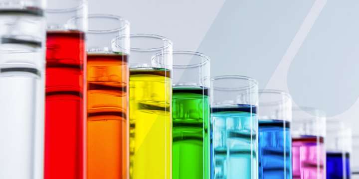
Thermochromism is the phenomenon of a material exhibiting a reversible change of color in response to temperature changes. For example, think of novelty cups that turn from blue to green when filled with hot or cold liquid. This color change isn't the result of user error, but instead a temporary alteration in the material's optical properties that causes the material to reflect or transmit different proportions of light across the visible spectrum.
As the temperature of the contents starts to normalize to room temperature, the original color gradually returns. In such products, these color alterations are the goal for the desired effect. In others, thermochromism is a consequence to avoid, making consistency the key to preventing it.
It's important not to confuse thermochromism with thermal degradation, an irreversible color change arising from extreme temperatures that can impact long-term color stability.
Environmental Instability and Material State Changes
Extreme temperatures can trigger physical changes in many samples that impact color perception, depending on the application. For example, thermal expansion and contraction can alter surface textures, changing how light reflects off the material and, in turn, the resulting measurements.
Measuring the color of hot liquids poses similar issues. As temperatures rise in these samples, bubbles and vapor often form that cause light to scatter differently, influencing appearance.
Additionally, temperature fluctuations can create secondary effects, such as the formation of condensation on sample surfaces. This excess humidity demands well-defined surface preparation protocols to ensure accurate readings.