About
BLOG

Interested in a little light reading?

Our blog is continually updated with helpful educational information, advises, research and insights—all in the name of helping you level-up your color and appearance needs. Grab a drink and enjoy our stories!

Explore Our Stories
4592763003_274da22a52_z.jpg

"Contrast Ratio: Determining the Opacity of Paints and Coatings Using Spectrophotometers"

Read More

Explore Our Products

VIEW MORE

4592763003_274da22a52_z.jpg

"Contrast Ratio: Determining the Opacity of Paints and Coatings Using Spectrophotometers"

Read More
4592763003_274da22a52_z.jpg

"Contrast Ratio: Determining the Opacity of Paints and Coatings Using Spectrophotometers"

Read More
4592763003_274da22a52_z.jpg

"Contrast Ratio: Determining the Opacity of Paints and Coatings Using Spectrophotometers"

Read More
photo-1444012830796-83db7e1db0d3.jpg

"Evaluating Spectrophotometric Solutions for Color Matching Challenges Posed by Gloss"

Read More
photo-1444012830796-83db7e1db0d3.jpg

"Evaluating Spectrophotometric Solutions for Color Matching Challenges Posed by Gloss"

Read More
photo-1444012830796-83db7e1db0d3.jpg

"Evaluating Spectrophotometric Solutions for Color Matching Challenges Posed by Gloss"

Read More

Contrast Ratio: Determining the Opacity of Paints and Coatings Using Spectrophotometers

Posted on Jan 27, 2026 by HunterLab

When painting a lighter color over a darker shade, contrast ratio and color opacity are extremely important. Quality paint and coatings pay off in the long run and are worth the extra cost. Image source: Flickr user Ewan Roberts

Everyone warned me when I painted my kitchen red that it would be a nightmare if I ever wanted to change colors, and eleven years later I am learning just how hard it is to brighten things up. In order to avoid buying several gallons of paint for one wall and repeating the vicious cycle of paint/dry/repeat, I am starting to learn a bit more about the importance of contrast ratio and color opacity.

Posted in Color Measurement

Contrast Ratio: Determining the Opacity of Paints and Coatings Using Spectrophotometers

Posted on Jan 27, 2026 by HunterLab

Beim Überstreichen einer helleren Farbe über einen dunkleren Farbton sind Kontrastverhältnis und Farbdeckkraft äußerst wichtig. Qualitativ hochwertige Farben und Anstriche zahlen sich langfristig aus und sind die zusätzlichen Kosten wert. Bildquelle: Flickr-Benutzer Ewan Roberts

Als ich meine Küche rot gestrichen habe, haben mich alle gewarnt, dass es ein Albtraum werden würde, wenn ich jemals die Farbe wechseln wollte, und elf Jahre später muss ich feststellen, wie schwierig es ist, etwas aufzuhellen. Um zu vermeiden, dass ich mehrere Liter Farbe für eine Wand kaufe und den Teufelskreis von Streichen/Trocknen/Wiederholen wiederholen muss, fange ich an, etwas mehr über die Bedeutung des Kontrastverhältnisses und der Farbdeckkraft zu lernen.

Posted in Color Measurement

Contrast Ratio: Determining the Opacity of Paints and Coatings Using Spectrophotometers

Posted on Jan 27, 2026 by HunterLab

When painting a lighter color over a darker shade, contrast ratio and color opacity are extremely important. Quality paint and coatings pay off in the long run and are worth the extra cost. Image source: Flickr user Ewan Roberts

Everyone warned me when I painted my kitchen red that it would be a nightmare if I ever wanted to change colors, and eleven years later I am learning just how hard it is to brighten things up. In order to avoid buying several gallons of paint for one wall and repeating the vicious cycle of paint/dry/repeat, I am starting to learn a bit more about the importance of contrast ratio and color opacity.

Posted in Color Measurement

Contrast Ratio: Determining the Opacity of Paints and Coatings Using Spectrophotometers

Posted on Jan 27, 2026 by HunterLab

Al pintar un color más claro sobre un tono más oscuro, la relación de contraste y la opacidad del color son extremadamente importantes. La pintura y los revestimientos de calidad compensan a largo plazo y merecen la pena el coste adicional. Fuente de la imagen: Ewan Roberts, usuario de Flickr

Todo el mundo me advirtió cuando pinté mi cocina de rojo que sería una pesadilla si alguna vez quería cambiar de color, y once años después estoy aprendiendo lo difícil que es alegrar las cosas. Para evitar comprar varios litros de pintura para una pared y repetir el círculo vicioso de pintar/secar/repetir, estoy empezando a aprender un poco más sobre la importancia de la relación de contraste y la opacidad del color.

Posted in Color Measurement

Evaluating Spectrophotometric Solutions for Color Matching Challenges Posed by Gloss

Posted on Jan 27, 2026 by HunterLab

Geometrische Merkmale wie Glanz können die Farbabstimmung erschweren, da das Licht auf das Objekt wirkt und die Farbwahrnehmung beeinflusst. Bildquelle: Unsplash Benutzer David Straight

Farbe ist eine der wichtigsten Eigenschaften von Industrie- und Konsumgütern, und Designer, Forscher und Hersteller machen sich unermessliche Gedanken über die ideale Pigmentierung von Produkten aller Branchen. Die Farbe ist jedoch nur ein Faktor bei der Bestimmung des Aussehens eines Produkts; das endgültige Erscheinungsbild eines Produkts ist das Ergebnis seiner chromatischen Qualitäten in Kombination mit den geometrischen Attributen - oder physikalischen Eigenschaften -, die die spezifische Art und Weise bestimmen, wie die Farbe vom Betrachter wahrgenommen wird.1 Geometrische Attribute können für die Funktionalität eines Produkts von entscheidender Bedeutung sein und einem Produkt sein wünschenswertes ästhetisches Aussehen verleihen. Diese physikalischen Eigenschaften können jedoch auch eine Herausforderung für die Farbabstimmung darstellen, wenn Komponenten mit unterschiedlichen geometrischen Eigenschaften den Anschein erwecken müssen, dieselbe Farbe zu haben. Der Glanz ist vielleicht das häufigste geometrische Attribut, das Hersteller berücksichtigen müssen. Er kann bei der Farbabstimmung erhebliche Probleme aufwerfen, da unterschiedliche Materialien zu drastisch unterschiedlichen visuellen Ergebnissen führen können, selbst wenn zwei Objekte die gleiche Pigmentierung aufweisen.

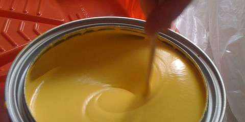
Die spektralfotometrische Bewertung von Hochglanzlacken erfordert die Wahl des richtigen Geräts und der richtigen Einstellungen für Ihre Zwecke, ganz gleich, ob Sie eine Farbrezeptur entwickeln oder mehrere fertige Komponenten aufeinander abstimmen wollen, um Farbharmonie zu gewährleisten. Bildquelle: Flickr-Benutzer felth

Posted in Color Measurement

Evaluating Spectrophotometric Solutions for Color Matching Challenges Posed by Gloss

Posted on Jan 27, 2026 by HunterLab

Geometric attributes like gloss can present color matching challenges based on the way light acts on the object and informs color perception. Image Source: Unsplash user David Straight

Color is one of the most important qualities of both industrial and consumer goods, and designers, researchers, and manufacturers put immeasurable thought into the ideal pigmentation of products across industries. However, color is only one factor in the determination of a product’s look; the final appearance of a product is the result of its chromatic qualities combined with the geometric attributes—or physical properties—that inform the specific way color is perceived by the viewer.1 Geometric attributes can be vital to the functionality of a product, as well as critical to giving a product its desirable aesthetic appearance. However, these physical qualities can also present challenges to color matching when components with different geometric qualities must appear to be the same color. Gloss is perhaps the most common geometric attribute that manufacturers must account for. It can pose significant problems for color matching, as differences in materials can produce drastically different visual results, even when two objects have identical pigmentation.

Evaluating high-gloss finishes spectrophotometrically requires choosing the right instrument and settings for your purposes, whether you are developing a color formula or seeking to match multiple finished components to ensure color harmony. Image Source: Flickr user felth

Posted in Color Measurement

Evaluating Spectrophotometric Solutions for Color Matching Challenges Posed by Gloss

Posted on Jan 27, 2026 by HunterLab

光沢のような幾何学的属性は、光が物体に作用し、色知覚に情報を与える方法に基づくカラーマッチングの課題を提示することができます。画像ソースUnsplashユーザー David Straight

色は、工業製品と消費財の両方において最も重要な品質のひとつであり、デザイナー、研究者、製造業者は、業界を問わず、製品の理想的な色素沈着に計り知れないほどの考えを注いでいます。製品の最終的な外観は、色が見る人によって知覚される具体的な方法を知らせる幾何学的属性、つまり物理的特性と組み合わされたその色の特質の結果です。1幾何学的属性は、製品の機能性にとって不可欠であるだけでなく、製品に望ましい美的外観を与えるためにも重要です。しかし、これらの物理的特性は、異なる幾何学的特性を持つコンポーネントが同じ色に見えなければならない場合、カラーマッチングに課題をもたらすこともあります。光沢は、おそらく製造業者が考慮しなければならない最も一般的な幾何学的属性である。素材の違いによって、2 つのオブジェクトが同じ色素を持つ場合でも、視覚的に大きく異なる結果が生じることがあるため、カラーマッチングに重大な問題を引き起こす可能性があります。

高光沢仕上げを分光光度計で評価するには、色の配合を開発する場合であれ、色の調和を確保するために複数の仕上げ成分をマッチングさせる場合であれ、目的に合った装置と設定を選択する必要があります。画像ソースFlickrユーザー felth

Posted in Color Measurement
Prev
25
26
27
28
29
…
Next

Most Related Posts

  • Temperature Effects on Color Measurement: Maintaining Accuracy in Extreme Conditions
  • Temperature Effects on Color Measurement: Maintaining Accuracy in Extreme Conditions
  • Temperature Effects on Color Measurement: Maintaining Accuracy in Extreme Conditions
  • Temperature Effects on Color Measurement: Maintaining Accuracy in Extreme Conditions
  • Temperature Effects on Color Measurement: Maintaining Accuracy in Extreme Conditions
  • Temperature Effects on Color Measurement: Maintaining Accuracy in Extreme Conditions
  • Temperature Effects on Color Measurement: Maintaining Accuracy in Extreme Conditions
View More Related Posts

Follow us on social

  • LinkedInFollow us on LinkedIn
  • YouTubeFollow us on YouTube
  • facebookFollow us on Facebook
  • XFollow us on X (formerly Twitter)
  • instagramFollow us on Instagram