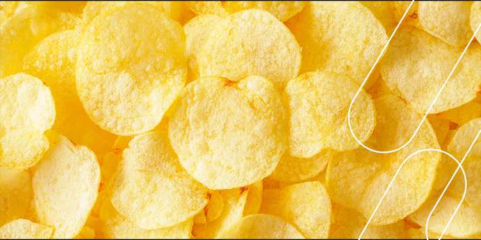
Colour quality and consistency are vital for potato chips, impacting their appeal to consumers in a competitive market. The visual colour standards reference chart for potato chips was developed to improve colour accuracy by illustrating chips ranging from light to dark. However, visual colour analyses are often inaccurate due to their subjectivity. Luckily, you can achieve precise colour measurements with spectrophotometers.
Flaws of Colour Reference Charts for Potato Chips
The potato chip colour reference chart is fully based on visual perception, which varies drastically from person to person due to:
Observer sensitivity: Colour appears differently to each person based on their natural eye sensitivity. As a result, some people see colours more vividly than others.
Lighting: Objects can look different under various light sources, which greatly impact colour.
Age: Human colour perception fades with age, meaning someone in their 20s will likely see a potato chip differently than someone in their 70s.
Retinal fatigue: The longer a person focuses on an object, the more their eyes strain, resulting in incorrect colour perception.
Object background: An object's background can impact how we view the sample due to the contrast between them.
Colour memory: Our brains use our previous experiences and expectations to identify colours, which often hinders our ability to see them correctly. For example, someone may identify an orange banana as yellow because they expect bananas to be yellow.