Being able to match a vehicle color perfectly is the mark of a high-end auto body repair shop. Image Source: Unsplash user Josh Rinard
When a consumer turns to a body shop for car repairs after a crash, their goal is to get their vehicle back in the best condition possible. Ideally, they want it to look like their vehicle was never in an accident in the first place. In part, this is driven by financial considerations; after a vehicle is in an accident, its value can drop by as much as 10%.1 This diminished value can be a significant issue and a point of contention between car owners and insurers, as it limits resale options for a vehicle. Of course, even owners who want to keep their vehicle typically also want to remove any indications of damage, particularly if the car is rare, valuable, or has sentimental value. As a result, the auto shops that can return a car to its pre-accident condition are in high demand.
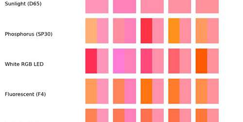
A significant part of the post-accident repair process is ensuring a seamless paint job without requiring the entire vehicle be repainted. For body shops, this means that paint matching must be a top priority. While you may have a good idea of the base color of the vehicle, matching that color identically virtually impossible without the use of modern technology. As such, spectrophotometers are essential to pinpoint the perfect color match.
Without proper color matching, a seamless collision repair job is not possible. Image Source: Unsplash user Ivan Sean