To the uninitiated, references to Pantone numbering conventions sound like they were created by a cryptographer—meaningless sequences of letters and numbers that are a far cry from the color wheels I remember using in high school art class. Even with the conventions deciphered, I still have trouble appreciating the difference between green color 3405 C and 3405 U.

But if you’re a designer, you’re probably acutely aware. You’re aware not just of the variance between these shades of green, but of the fact that, even with the Pantone system, underlying colors that ought to be the same can differ on the journey from graphic design studio to industrial application.

The color differences between design and production are explained, in part, by the fact that color impressions in the two-dimensional rendering of a product can be completely different when applied to a three-dimensional physical product. Fortunately, hand-held spectrophotometers provide a workaround, allowing graphic and industrial designers to specify exact color parameters that will not get lost in translation.

Color Trends in 2017

14439913217_bb0cd2edc9_z.jpg

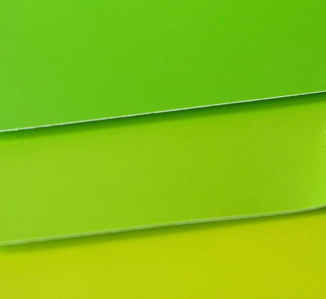
Many 2017 color trends require careful quality control to ensure the correct consumer impression | Image credit: Flickr user Harry Rose (CC BY 2.0)

Minute color differences can have a heavy impact, especially for designers hoping to keep up with current trends. The Color Marketing Group (CMG), for instance, suggests that the hottest color for 2017 is a yellow-influenced green with the moniker “Thrive”1. This color’s mix of green and yellow is meant to evoke growth and newness. But CMG cautions that the balance of these shades “does not mean dull, and the color’s strong yellow influence [should add] freshness and vitality to create a feeling that is vigorous and comforting, all at once.” In other words, “Thrive” may be lovely, but just a little too much yellow, and you’re more likely to evoke pea soup than vitality.

Pantone’s entry into the color of the year is a slightly brighter green with the name “Greenery”2. Echoing CMG’s choice, Pantone believes that “Greenery” should evoke the first days of spring, with implications of restoration and renewal. Pantone notes that “Greenery” can be paired with “neutrals, brights, deeper shades, pastels, metallics”.  

However, the implication of both CMG’s and Pantone’s choices is that a designer who skews shadings, balances, or color blending too far from the base colors will fail to create the intended impression, producing hues unlikely to resonate with consumers.

READ  What Is Haze in Liquids and How Can I Measure It Accurately?

Color Saturation, from Intense to Muted

5909013068_112dc425c6_z.jpg

The visual appearance of a color is partly a function of saturation | Image credit: Flickr user Kate Ter Haar (CC BY 2.0)

But capturing the correct color balance is largely a function of varying the degree of color saturation in your final products. If you’re trained in making fine color distinctions, you might be able to select the optimum color in product mock-ups, but the actual physical product will inevitably feature multiple surfaces, different densities, and color layer thicknesses that can skew an end user’s color perceptions.

Rather than relying on intuition, you’re better served by using a spectrophotometer to establish a set of color coordinates that then become part of the overall design specifications for your product. The spectrophotometer can scan and store your color selection as a reference for the manufacturer.

Those stored coordinates provide an objective standard color profile that will not be distorted by reflectance or translucence of any underlying materials. Unlike standard L-a-b or LCH color coordinates, spectrophotometric coordinates can also be obtained without being affected by metamerism, the phenomenon under which different lighting can generate different impressions of underlying color3.

INFO  Get More Information

Spectrophotometric Technology to Keep Pace with Design Trends

Handheld and portable spectrophotometers are no longer confined to large design shops and well-financed mass manufacturers. Next-generation spectrophotometers are available to provide reflected color measurement, to measure color on small samples or on discrete areas of samples, and to filter out surface effects such as gloss and texture4.

For designer and manufacturers concerned with quality control and assurance, HunterLab also produces a number of devices with advanced QC and QA software that gives the user color data and spectral displays that can be formatted in numerical spreadsheet or graphical form, allowing you to store reference information for an unlimited number of samples and for separate clients and jobs. Independent designers and small design shops are using these devices to stay at the forefront of color trends and to remain competitive in a rapidly changing market.

For more information about hand-held spectrophotometers and their uses in all areas of graphic and industrial design, and to connect with equipment suppliers that can provide the information and service that your design shop needs, get in touch with HunterLab today.