
How Fast-Food Chains Utilize Colour
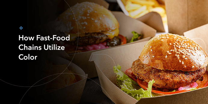
Colour plays an essential role in our sensory palette. While most people think of taste or touch when they hear the word “food,” sight and colour also go a long way. Fast food advertising colours have a major impact on how people feel when they see an ad. Knowing how to use them can be the difference between leading someone to crave the juicy burger they see on their screen and making them lose their appetite.
Colours That Make You Hungry
Using colour psychology at a fast-food chain can convince consumers to buy food products. However, only specific hues evoke the desired response. Some of the colours that make people feel hungry include:
- Red: This colour can trigger numerous emotions, the first being passion. However, it’s also an attention grabber and stimulates the appetite. Red can make someone feel impulsive, explaining why they might suddenly decide to pop into the chain for a meal.
- Yellow: This colour brings about feelings of happiness or comfort, making the customer think about grabbing a bite to eat and enjoying it at a nice location.
- Green: This colour appeals more to the conscientious than the impulsive, enticing viewers who are into more natural, “earth-friendly” food.
- Pink: This colour is often associated with love and calmness. Incorporating pink into a brand can inform someone that whatever they are going to consume will be relaxing and sweet. However, you have to be careful with pink, as it can also evoke some negative images. This shade might be better for a place selling ready-made pastries.