What colours work well together, and how do you choose the right combinations to match different hues? You may be surprised to learn that there is actually a science behind colour matching and which colours work best together. Knowing how to match colours can aid with a variety of industrial and design applications. Explore our colour matching guide to learn more.

Colour Matching and Colour Theory

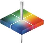
Colour theory provides an organizational structure for mixing and matching colours accurately. Essentially, colour theory is a set of guidelines that use accumulated observations of human perception and psychology to identify colour combinations that evoke different observer responses.

When you use colour matching, you’re able to combine hues that create a pleasing aesthetic for viewers. Some critical elements for effective matching include an eye-catching contrast and the right vibrancy to evoke emotion. You’ll want to pay attention to how different selections across the colour wheel can create the desired emotional and psychological response from your audience.

Primary Colours

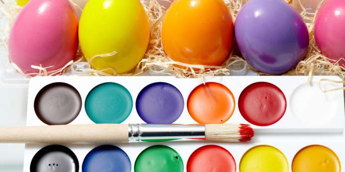
The colour wheel includes three primary colours foundational to other hues — red, blue and yellow. These three colours will always harmonize and are classic colours that work with many different designs. Eye-catching and bold, they create a vibrant visual effect. Two primary colours together will look bold yet sophisticated, and all three together can look cheerful and energetic.

Read  Food Coloring Regulations and Standards

Complementary Colours

On the colour wheel, complementary colours are two colours on opposite sides of the structure. Blue and orange, green and pink, and purple and yellow are all complementary colour combinations. The contrast between complementary colours helps both hues stand out and adds visual interest. Choosing complementary colours with a similar brightness will look particularly pleasing together.

This type of colour combination produces a marked contrast, so ensure you’re using it tastefully. Complementary colours offer eye-catching interest, but too much can feel overdone. One option might be to use a few complementary colours with some more toned-down options that don’t contrast as strongly.

INFO  Get More Information

Analogous Colours

Analogous colour matching works by using colours within the same family for harmony and gentle blending. Analogous colours are colours next to each other on the colour wheel, such as orange and yellow. By putting together similar colours of slightly different warmth, this type of combination creates a nuanced and rich harmony rather than contrast.

In this type of scheme, one colour will accent, one will support and one will stand out as dominant. Analogous colours work well for accenting or enhancing one element.

Choose HunterLab for Colour Measurement Solutions

At HunterLab, we’re passionate about colour and its practical applications in critical industries. If you need trusted solutions for colour measurement, we offer innovative equipment and tools to address your requirements. We’ve been developing cutting-edge solutions for over 65 years, and we continue to lead the industry, ensuring product safety and quality with accurate colour measurements.

For more information about our products, reach out to our team today.