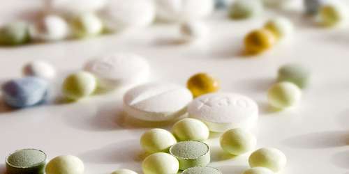
Medication colour can have a significant impact on user perception and behavior. Image Source: Flickr user Taki Steve

Colour can deeply affect our moods, cognitive function, and sensory experiences. Red, for example, is regarded as invigorating, and interior designers encourage its use in dining rooms to create energy and spark conversation while hospital waiting rooms are often painted in soothing pastels for relaxation. However, colour has a profound impact even in unexpected places and can have significant implications for public health. Recent research indicates that colour plays a powerful role in consumer experiences with pharmaceutical products, affecting both patient expectations and behavior, influencing health outcomes and quality of life.

10093126736_9db9ec6750.jpg

Research shows that colour affects how patients perceive efficacy, tolerability, and side-effects of medications. Image Source: Flickr user Kevin Dooley

Read  Colour-Coding Technology: 50 Shades of Grey Pills?

The Effect of Colour on Perception of Medication

A study released earlier this year examined the effect of colour on the perceived efficacy, bitterness, ease of use, and stimulation of headache medication.1 In a set of three experiments conducted in the United States, Colombia, and China, subjects were shown pills in seven different colours and asked to report their user expectations. White pills were regarded as the most effective by subjects from all three cultures while light green pills were seen as the least effective. Red and light red pills were perceived as the most stimulating and light blue pills were expected to be the least bitter. Although colour was not a factor in ease of use expectations for American and Columbian subjects, Chinese subjects saw red and blue pills as harder to swallow. The results indicate that colour is a significant factor in how medications are seen by users and can influence consumer choice in the pharmaceutical marketplace.

Colour variation between generic drugs can have both acute and long-term health consequences. Image Source: Flickr user Health Gauge

Medication Colour as a Determinant of Patient Persistence

Visual appearance of pharmaceuticals may also play a major role in patient persistence — or ability to take medication as directed for the intended duration — when switching from a brand-name drug to a generic version or between generic versions. The FDA currently does not mandate consistent appearance in generic drugs, leading to wide variation in colour between samples of therapeutically identical drugs. A study published last year examined 11,513 patients who began taking generic drugs such as ARBs, beta-blockers, statins, and ACE inhibitors following hospitalization for a heart attack between 2006 and 2011.2 Nineteen percent of patients experienced at least one colour change within the first year and those patients whose medication changed in visual appearance were 34% more likely to prematurely discontinue medication. Lack of persistence can have profound health consequences and increased risk of future cardiovascular problems for these patients.

While the FDA does not require visual consistency in generic pharmaceuticals, it does recommend that pharmaceutical manufacturers consider physical attributes when developing generic versions of brand name drugs. Indeed, growing evidence of aesthetic functionality suggests that consistent pigmentation of generics can promote patient persistence and, as a result, improve health outcomes. Drugs of different colours may have identical therapeutic properties, but patient perception and behavior are vital components of how drugs work in practice, and careful colour monitoring is required to optimize user experience.

INFO  Get More Information

Integrating Spectrophotometers in Colour Management

Increasing awareness of the powerful role colour plays in consumer experiences of pharmaceuticals highlights the importance of creating colour palettes that enhance user perception and safeguarding colour consistency to promote persistence. By integrating spectrophotometer technology in pharmaceutical production lines, manufacturers can assure product quality, but also closely monitor drug pigmentation to establish a desirable aesthetic standard and ensure consistent colour production to prevent visual disparity. In-process monitoring provides immediate feedback to operators when colour drifts out of spec and allows for immediate corrective action to be taken, minimizing costs, and containing defective product before it leaves the manufacturing facility. For over 60 years, HunterLab has been at the forefront of colour analysis and supplied the pharmaceutical industry with the most modern instruments available for comprehensive quality control. Our flexible, sophisticated tools allow for optimal colour management, giving you the ability to produce the best products available to improve the lives of patients. Please contact us today to learn more about our innovative range of spectrophotometers and how we can take your colour management program to the next level.