クリアレックスの台頭
デボラ・アドラーは医学を変えようと思ったわけではない。医師の家系に生まれながら、彼女は別の道を選び、ニューヨークのスクール・オブ・ビジュアル・アーツの修士課程に入学した。しかし、アドラーは30歳になる前に、最も一般的な医薬品である処方箋ボトルに革命を起こした。
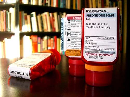
It all started when her grandmother accidentally took medication prescribed to her husband. “The drug store prescription bottle, it occurred to Adler, is not just unattractive, it’s actually dangerous. Statistics back her up: According to a recent poll conducted for Target, 50 percent of prescription-drug users have taken medication incorrectly.”3 To correct this, Adler devoted her senior thesis project to a new and improved prescription bottle design that prioritized function over form; each prescription bottle has a large flat surface onto which the label is attached, making it easy to read. The label itself features the name of the drug prominently across the top of the bottle and the top of the label, with directions directly below, making it easy to identify each medication and understand how to use it. But one of the most remarkable aspects of Adler’s design was the use of color; in her original concept, each family member was assigned a unique label color to easily differentiate between users, preventing potentially harmful medication errors.
アドラー社のClearRxボトルのデザインはすぐにターゲット社に採用され、ターゲット社はアドラー社と協力して若干のデザイン変更を行った。家族ごとに異なる色が割り当てられ、簡単に区別できるようになっている。ミネアポリスのターゲット顧客であるリチャード・ストーンにとって、色分けシステムは大きなセールスポイントである。彼と彼の妻はそれぞれ3~4種類の薬を服用しており、「新しいボトルは役に立ちます」4「私は青、彼女は赤です。どっちがどっちかわかりやすくなったよ」。CVSが最近ターゲットの薬局を買収した後、ボトルが段階的に廃止されたとき、アドラーのデザインの信奉者たちは激怒し、ツイッターで愛用の処方箋ボトルの返却を要求した。一部のアナリストは、ターゲットの売上減少を従来のボトルへの回帰のせいにさえしている。ローラ・ノースラップが今月初めにコンシューマー誌で指摘したように、「CVSよ、注意してほしい:人々は本当に、本当に、本当にあのボトルが好きなのだ」5 。
CVSがクリアレックスを復活させるかどうかは、時間が経てばわかるだろう。しかし、その一方で、処方箋ボトルにTargetの顧客が傾倒していることは、「色分けされたパッケージは効果がある」という明確なメッセージを送っている。製薬会社が服薬アドヒアランスを高めるための重要なパッケージ要素として色を使うことが増えている現在、ClearRxはそのような努力の知恵を示す具体的な実例である。