About
BLOG

Interested in a little light reading?

Our blog is continually updated with helpful educational information, advises, research and insights—all in the name of helping you level-up your color and appearance needs. Grab a drink and enjoy our stories!

Explore Our Stories

"Do you have references for the equivalency of CIE inverse instrument geometries?"

Read More

Explore Our Products

VIEW MORE

"What is the Bidirectional scattering distribution function?"

Read More

"Where does one find the EP (European Pharmacopoeia) Liquid Color Matching Standards?"

Read More

"What are the NCI National Cheese Color Standards?"

Read More

"Getting Started With Color"

Read More

"Is there a Munsell HVC color conversion in EasyMatch QC?"

Read More

"Does Color Perception Change Over Time?"

Read More

Do you have references for the equivalency of CIE inverse instrument geometries?

Posted on Nov 29, 2023 by HunterLab

FAQ: “…. the schema of the principle of measuring shows other way of light (source of light -> sample -> sphere -> detector) than our Vista (source of light -> sphere -> sample ->  detector). Please can you explain me difference between both construction? difference between both results of measuring?”

This describes the concept of equivalency of inverse geometries for color measuring instruments in reflectance where the source of light -> sphere -> sample ->  detector in a CIE diffuse d:8 geometry is equivalent to the source of light -> sample -> sphere -> detector of an 8:d geometry. The same concept applies to CIE directional 45:0 and 0:45 geometries.

An instrument with directional 45:0 geometry on the left matches the viewing condition of the technician at the window, and is equivalent to the 0:45 geometry on the right matching the technician viewing samples in the light box.

When you look at a sample color, the color you perceive is dependent on the geometry of how you look at it – where source of white light is; where you are standing and where the sample is.

To measure a color as you perceive it, the instrument geometry must match the way you view the sample. A CIE instrument geometry is a formal definition of the relative positions of the light source, sample plane and detector to each other.

There are two main categories with 2 equivalent geometries each – diffuse d:8 (most common) and 8:d and directional 45:0 (most common) and 0:45.

Posted in Color And Appearance Theory

What is the Bidirectional scattering distribution function?

Posted on Nov 29, 2023 by HunterLab

BSDF = BRDF + BTDF

BSDF – “Bidirectional scattering distribution function” is a goniophotometric measurement for the light scattering off and through the surface of a material.

BSDF can be separated into the reflected and transmitted components – BRDF (Bidirectional reflectance distribution function) and BTDF (Bidirectional transmittance distribution function). A BSDF scattering pattern can be uni-planar but often several views are assembled to present a three-dimensional scattering model of how light interacts with the material.

BRDF – “Bidirectional Reflectance Distribution Function” assumes a solid, opaque sample surface and measures the reflectance of a target as a function of illumination geometry and viewing geometry. The scattering pattern of the surface of a material is dependent on wavelength and on multiple structural and optical properties.

Remote sensing and sophisticated animation modeling are two areas of application for BSDF. Another area is in the design of sophisticated optical devices that have been modeled with ray tracing software and a prototype built. At this point, a BSDF measurement might be performance of the prototype device to see how well the optical properties of the prototype match the tracing model.

While colorimetry is often determined from the BSDF reflectance or transmission data, BSDF light scattering patterns are not typically measured for most typical industrial products while color often is.

Posted in Color And Appearance Theory

Where does one find the EP (European Pharmacopoeia) Liquid Color Matching Standards?

Posted on Nov 29, 2023 by HunterLab

EP – European Pharmacopoeia Color Stds measured

EP – European Pharmacopoeia Color is a visual liquid color scale used primarily in the pharmaceutical industry. It consists of 3 primary color standard solutions (yellow, red and blue) mixed with hydrochloric acid to make 5 standard color solutions – B (brown), BY (brownish-yellow), Y (yellow), GY (greenish-yellow) and R (red). These 5 standard color solutions are further diluted with hydrochloric acid (10 mg/l) at different concentrations to make 37 reference EP liquid color standards – 9B, 7BY, 7Y, 7GY and 7R, radiating out from distilled water at the center.

Posted in Color And Appearance Theory

What are the NCI National Cheese Color Standards?

Posted on Nov 28, 2023 by HunterLab

“Monterey Jack cheese….natural white, not darker than #2 using the National Cheese Institute Color Chart … Cheddar cheese….natural color, not darker than #9 using the National Cheese Institute Color Chart…” www.farmdale.net

“…initial point of sale for: Cheddar cheese in 40 pound blocks, colored between 6 and 8 on the National Cheese Institute color chart…” www.cmegroup.com

“…Feta is white in color, is a bit sour to the taste and rich in aroma … Fresh Asiago has an off-white color and is milder in flavor than mature Asiago. Mature Asiago also has a more yellowish color and is somewhat grainy in texture … Cream cheese is usually white in color and is available in low-fat or non-fat varieties … Blue cheese….is spotted or veined throughout with blue, blue-gray or blue-green mold, and carries a distinct smell….” www.idfa.org

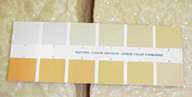
The National Cheese Institute’s Color Standards are a series of 12 Munsell color chips initially intended for the visual color grading of hard cheese.  Additionally it has been applied to the color of products from soft cheese spreads to condensed milk.

The National Cheese Institute is part of the US International Dairy Foods Association (IDFA), which also represents the Milk Industry Foundation and the International Ice Cream Association.

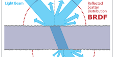
The color quality concern for cheese products is color uniformity within a lot, and color consistency from lot-to-lot.

In a well-lighted area, preferably daylight balanced, a person would assign the nearest NCI grade based on a visual comparison between the printed chart and the sample cheese color.

The NCI Cheese Color grade provides a more systematic and consistent method of color communication for cheese products than the random vocabulary of individual people and serves as a basis for purchase of large quantities of cheese products.

Posted in Color And Appearance Theory

Getting Started With Color

Posted on Nov 28, 2023 by HunterLab

Color is a way our eyes perceive the reflected or transmitted light from opaque and translucent objects and liquids at different wavelengths.

So how do colors work together to become what our eyes see? What are primary colors, secondary colors and tertiary colors? Explore color basics, the color wheel and color temperatures understand these interactions of color in the real world.

Diving Into the Color Wheel

The color wheel is an illustrative model that represents different color hues around a wheel. The colors are organized to demonstrate the relationships between different hues.

Originally designed in 1666 by Isaac Newton, the color wheel has three main components:

  • Three primary colors — yellow, red and blue
  • Three secondary colors — orange, purple and green
  • Six tertiary colors — combinations of primary and secondary colors, such as blue-green

These elements move from warm colors to cool colors as you go around the wheel.

Posted in Color And Appearance Theory

Is there a Munsell HVC color conversion in EasyMatch QC?

Posted on Nov 28, 2023 by HunterLab

FAQ: “Do you offer a Munsell HVC color conversion in your EasyMatch QC software?”

The Munsell HVC or Hue Value Chroma color scale is a visual reporting scale based on paint and plastic chips not as precise as colorimetric scales such as L*, a*, b*. The HVC values are the designation of the nearest Munsell Color chip that matches a sample color.

Think of color communication as being at 3 levels:

  • Word descriptors – “What is Salmon Pink?” Words often mean different colors to different people and it is both a subjective and imprecise means to communicate color.
  • Visual Color Standards – These usually feature color chips of some type like Munsell, Pantone, Natural Color Systems, RAL, Fed Std 595c.The best ones cover most of color space and are arranged in a systematic manner. These visual color standards do provide a physical representation (paint or plastic chip) of the color. The chip chosen is closest to the target color but there may be a visual difference such as when surface characteristics differ.  Although still subjective, these visual color standards are better than words as a color reference.
  • Colorimetric Measurements – Measure the actual product in a precise and objective manner using colorimetric instruments and color scales.

FAQ: “Is there an easy way to report Munsell HVC values for my product colors?”

HunterLab does not offer a Munsell HVC Color conversion in our software, but there are other options.

Wallkill Color offers two cost effective options for reporting Munsell Color:

  1. Free Excel file of 2352 Munsell colors with corresponding color values that you can search to find the nearest Munsell color and report it.
  2. A software conversion program available for reasonable $ where you can enter or cut-and-paste colorimetric values from EasyMatch QC and have the program report the corresponding Munsell color values.

Another good site by Bruce Lindbloom for visualizing the display of Munsell Colors as a visually uniform color space.

Posted in Color And Appearance Theory

Does Color Perception Change Over Time?

Posted on Nov 28, 2023 by HunterLab

Every person perceives color differently. A unique combination of genetics and circumstances influences each individual's connection to and view of various hues. If you've ever had the experience of talking with an older adult and disagreeing on the color you're both seeing, you may find yourself questioning whether color perception changes with age — and sometimes, it can.

Differences in Color Perception

Some of the reasons you may perceive a different color than the person next to you may include:

  • Genetics: The most well-known reason for differences in color perception is genetics. Color blindness affects one in 12 men and one in 200 women, usually due to a genetic marker in the X chromosome.
  • Culture: Different geographical locations place varied emphasis on colors, combining hues like blue and green or navy and black into one word in their languages. Some languages have even more words to describe different shades.
  • Trauma: Occasionally, injury or illness can bring on partial blindness or colorblindness that affects color perception. Common causes include brain or eye injury or an illness like diabetes.
  • Age: While your perception of color may remain the same for most of your life, your eyesight can begin to change and deteriorate as you age. Some people develop a yellowish tint to their vision, most often after age 70, which can affect their ability to differentiate between shades of yellow, blue, and green.

Posted in Color And Appearance Theory
Prev
4
5
6
7
8
Next

Most Related Posts

  • What Is Color Stability and Why Is It Important?
  • Spectrophotometer vs. Colorimeter: What’s the Difference?
  • Food Coloring Regulations and Standards
  • Luminance vs. Illuminance: What’s the Difference?
  • What Is Color, and How Do We See Color?
  • ROY G BIV… A Series
  • The Difference Between Biofluorescence and Bioluminescence
More

Follow Us

  • LinkedIn
  • Twitter
  • YouTube