Research shows that color is one of the most significant variables affecting customers' choice of virtually all consumer goods, from the foods we eat to the clothes we wear to the medications we take. Colors are vital to guiding consumer choices — selecting the correct hues can be crucial to a product's success.
As such, understanding how color theory works is essential to your ability to harness the potential of colorfully. You can attract customers, enhance their experiences, and shape customer relationships with your product with appealing color harmonies.
What Is Color Harmony?
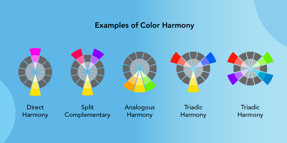
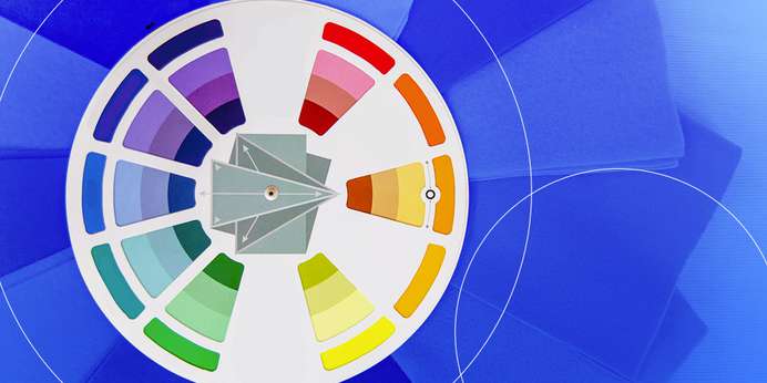
Color harmony is a set of rules for producing visually appealing color combinations. These ideas frequently use the color wheel, a circular depiction of primary, secondary, and tertiary colors ordered in rainbow order.
You can find color harmony by placing geometric shapes on the wheel. Choose your key color — the color in your design you cannot change or want to draw attention to — and locate the color harmony types on the color wheel to identify the combinations most pleasing to the eye.
Once you have found harmonious colors, you can adjust their saturation, tone, tint, and shade. These factors make colors brighter, darker, or lighter, letting you achieve more hues beyond the standard 12 on the color wheel. Changing these aspects of your colors can give your color scheme the right look or mood for your project.
How Understanding Color Harmony Can Help Enhance Consumer Perception and Experience
Color is very significant in product marketing. It is an effective marketing tactic that impacts customer purchases in various ways. Marketers must explore color harmony to promote items successfully. Almost every product sold nowadays has a colorful façade. Choosing the proper colors can have a significant influence on product sales. While no one set of rules governs color choices, research has created broad recommendations based on associative learning, which describes the link between color and emotion.
Color goes beyond visual appeal — it can affect a person's perceptions and behaviors. Color psychology studies how colors impact human behavior, especially for branding. Your color choices will impact your customers' impression of your brand, including whether they purchase from you. Marketers employ color associations to enhance product sales by conveying a message to the customer. Colors enhance consumer perception and experience through:
Package Designs
Package designs and colors help customers decide if they want to purchase the product. For example, most toothpaste and whitening strip packets are blue. Blue is linked with cleanliness, reinforcing the product's promise of white teeth. White symbolizes purity, making it a perfect accent color. Black is frequently the color of choice for electronics and other luxury effects. These things are costly, and the dark hue helps to promote them as rare, high-quality items.
Brand Recognition
Colors help you stand out from competitors or differentiate between product types. Your colors speak to your brand's personality, so choose colors that speak to the brand image you want to portray. Use the same colors across all your branded materials to make your brand recognizable. Successful color manipulation allows buyers to quickly and effortlessly recognize the desired brand among a sea of identical items.
Customer Associations
Every color is associated with a mood or concept. Make use of these connections to tie your items to a specific emotion. While certain color associations appear deeply ingrained, the consumer's personality, age, gender, and cultural background all have a significant role — various colors appeal to different personality types of buyers.
Fast food restaurants and clearance sales employ stimulating hues such as red, orange, and black to create a sense of urgency in impulsive purchasers. Lighter shades of pink and sky blue are used in retail clothes stores to create a quiet, pleasant environment for traditional consumers who want to browse things at their leisure.
Examples of Color Harmony