Colour theory is an integral part of all design processes. In short, colour theory assigns a logical structure to colour based on light spectrums, highlighting which colours aesthetically complement each other. When you employ the fundamentals of colour theory in your design, you can create unforgettable branded products.

The Colour Wheel and Colour Categorization

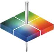
Isaac Newton first designed the colour wheel in 1666 to orient and observe the harmony of the three primary colours — yellow, blue and red. All colours are derived from a mixture of these three primary hues, which you can then use to create secondary and tertiary colours. However, certain industries may use red, green and blue or cyan, magenta and yellow as their primary colours, depending on the demands of their medium.

The primary colours — yellow, blue and red — combine to create the secondary colours green, purple and orange. No matter the orientation of the wheel, the primary colours are always across from each other and create a triangle. Colours are then categorized by complementary colours, which are located opposite each other on the colour wheel. Complementary colours are great for creating eye-catching accents. However, overusing complementary colours might appear garish and overwhelming to your viewer.

You can also mix secondary colours to create tertiary colours like blue-green, blue-purple, red-purple, red-orange, yellow-green and yellow-orange. All tertiary colours are formed by mixing a half-saturated primary colour with a fully saturated primary colour. Learn more about other types of colour mixing below.

Read  Colour Meanings and Communication

Additive Colour Mixing

Additive colour mixing is reserved for digital media that uses red, green and blue as their primary colours. In additive colour mixing, you can mix light waves to create new colours using RGB colours of varying intensities. The more light you add to a colour, the brighter a colour you will create.

Subtractive Colour Mixing

Colours schemes designed for physical surfaces such as packaging, paper and signage are created using a subtractive colour mixing practice. When you add more colour, you subtract the light from your colour scheme. You can create the primary colours with the following mixes:

  • Cyan and yellow create green.
  • Magenta and yellow create red.
  • Magenta and cyan create blue.
INFO  Get More Information

Why Colour Theory Matters

Colour is a product of our perception of light reflections. When you take advantage of this perception, you can create a memorable product that stands out above your competitors and is instantly recognizable. Creating a distinct and consistent colour scheme for your products is essential to building your brand image because consumers tend to make snap judgments about whether they’re likely to purchase a product. If they recognize your colours or design, they’re more likely to pick you.

When you thoroughly understand colour theory and how it affects your customers and keep your designs consistent, you can create memorable and trustworthy branding that consistently grabs your customer’s attention.

Spectrophotometers From HunterLab

At HunterLab, we’ve led the field of spectrophotometry for more than 40 years and carry the precise instruments you need to measure colour. Contact us online today to learn more about how we can help your business.