Every day you are surrounded by colours — they may inspire, motivate or remind you of something else you experienced. Because colour plays such an important role in how most people experience the world, it also looms large in the human psyche. Different colours affect mood in significant ways. As a result, you can use specific colours to communicate ideas and even influence behavior.

How Colours Affect Your Mood

People associate different colours with various emotions and concepts. Colour meaning and psychology are closely linked, with certain colours shown to impact mood. Exposure to specific wavelengths of light can even produce physiological responses, impacting heart rate and alertness.

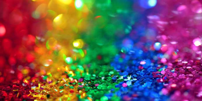
Ideas about a colour’s meaning in life vary from person to person. However, themes crop up around specific colours. When you understand what a colour means, you can use it to create a desired atmosphere or encourage specific responses in an audience. In Western countries, colours on the visible light spectrum are typically associated with the following ideas and emotions:

  • Red: Energy, passion, determination
  • Orange: Ambition, youthfulness, extroversion
  • Yellow: Optimism, happiness, excitement
  • Green: Growth, peace, nature
  • Blue: Relaxation, trust, loyalty
  • Purple: Prosperity, imagination, focus
  • Grey: Strength, stability, longevity
  • Brown: Comfort, reliability, seriousness
  • White: Purity, cleanliness, harmony
  • Black: Power, sophistication, mystery
Read  Basics of Colour Theory

Factors That Impact Your Perception of Colour

Not everyone interprets colour the same way. For some people, the colour red might feel passionate and exciting, while others might see it as aggressive or frightening. Varying opinions about the different meanings of colours can quickly lead to miscommunication, both when using colours to communicate ideas and emotive words to describe colours.

INFO  Get More Information

To communicate effectively using colour, it’s important to consider all the factors that influence a person’s perception of a hue. These factors can include:

  • Culture. People from different cultures have distinct ideas about colour meanings and symbolism. In Western cultures, white may be associated with purity and simplicity, while in East Asia, white serves as a colour of mourning.
  • Colour value. People may perceive a colour as more or less powerful depending on its value, or darkness. A lighter shade will feel less powerful than a darker hue.
  • Colour saturation. People may decide a colour feels more or less exciting depending on its saturation, or the amount of grey it contains. Colours with higher saturation look bold and energetic, while colours with lower saturation appear soft and gentle.

Communicating About Colour Effectively

Colour has the power to support nonverbal communication. As a result, brands and organizations across industries use colour to evoke emotional responses and communicate their values. However, communicating through and about colour comes with complications.

Texture and viewing angle can affect how the human eye perceives an object’s pigmentation, so reproducing a colour reliably can prove challenging even with a prototype or reference image. Spectrophotometry helps solve this problem by providing an objective way to measure colour. Colour measurement scales quantify attributes of a colour, simplifying communication between team members.

At HunterLab, we provide spectrophotometry instrumentation to help you make the most of colour’s effect on communication. Learn more by filling out our online contact form today.