Color theory is all around us — in the products we use, the images we see and the nature in our backyards. Understanding color theory is critical to anyone in design, and it plays a crucial role in product development and brand imagery. Even color theory psychology is a growing trend. So what is it exactly?For starters, modern color theory has no shortage of definitions, but generally, it refers to the concepts behind our perceptions of color. So, to understand the basics of color theory, you must know how colors work.

What Is Color?

The way we perceive color makes it seem like the objects around us all have inherent visual properties attached to them. For instance, an apple is red, grass is green and the sky is blue, with little deviation.

What we find out, however, is that color is a matter of perception. It requires three things:

  • An object
  • A light source
  • An observer

The light source can be natural or human-made, and the observer doesn’t necessarily need to be a living creature — it can also include machines like cameras and spectrophotometers.

When light bounces off an object, photons and electrons interact, with electrons absorbing or reflecting the light. In the process of reflection, the electrons release specific wavelengths of energy that correspond to certain colors, which our brains process.

How Do We See Color?

While light reflections release specific wavelengths, our brains interpret them as the colors we know and love. First, the reflected light enters the eye through the cornea. Then, a lens focuses it into the retina, the layers of nerve cells at the back of the eye.

The retina contains cells called photoreceptors, mainly rods and cones, that detect light waves.

  • Rods activate in low or dim light and do not process colors.
  • Cones activate in bright environments and contain specific pigments that correspond to our perceptions of red, green and blue.

These photoreceptors weave their way to the brain, connecting the communication patterns from the neurons in the retina to the brain.

Color vs. Appearance

In the common vernacular, color is typically a characteristic of appearance. For our purposes, appearance refers to surface features, like gloss and texture.

As light reflects off an object, it can take a few differing paths, based on the smoothness of the surface.

  • Specular reflection: Specular reflections occur on surfaces with relatively few imperfections. You might see specular light in a still lake. It would reflect the trees and the clouds above it, so you could make out the image.
  • Diffuse reflection: A diffuse reflection is much more common. It happens when the surface is rough or textured. The light reflects in random directions and won’t maintain an image of the source light.
  • Combinations: Both specular and diffuse reflections can occur at the same time. Usually, this happens with scattered light distributed in a specific group. Semi-gloss and textured metals are an example of these mixtures. You may be able to see a low-resolution reflection of the image around it.

These surface characteristics can influence how we interpret color. For instance, coarse texture is going to reflect the light in more directions and appear lighter in color than a smooth, high-gloss surface. This effect occurs because less of the light is reaching your eyes when it scatters.

READ  Color Meanings and Communication

Color Mixing Processes

02.jpg

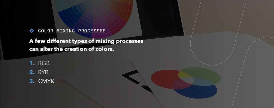
A few different types of mixing processes can alter the creation of colors.

1. RGB

Additive mixing is the process by which red, green and blue light combine to create other colors. Many electronics use RGB color processing to generate an image. Combining all three creates white light, which is why prisms separate into colors of the rainbow.

2. RYB

RYB refers to the three primary colors that you might be familiar with from elementary school — red, yellow and blue. When mixing physical media, RYB mixing is a subtractive model, in which inks or pigments create new colors when they absorb certain parts of the visible spectrum.

3. CMYK

CMYK colors are another subtractive process, the one your everyday printer uses. The letters in CMYK stand for cyan, magenta, yellow and key. Key typically refers to black, which is a bit darker than what you would get if you mixed the three other colors.

The Color Wheel

You may be familiar with the color wheel already. It’s been around since the 18th century, when Isaac Newton created an early form of the basic color wheel after noticing the light refracting from a prism. This wheel contains all the colors in the visible spectrum, and can create color combinations that are pleasing to the eye. It is one of the fundamentals of color theory.

Primary, Secondary and Tertiary Colors

The color theory wheel includes a few different types of colors. Remember that additive mixing will produce different colors out of the combinations.

  • Primary colors: The primary colors are red, yellow and blue, and can create all other colors in a subtractive color mixing process.
  • Secondary colors: Mixing the primary colors creates the secondary colors — green, orange and purple.
  • Tertiary colors: To get the tertiary colors, you would mix a primary and secondary color. The tertiary colors are yellow-orange, red-orange, red-violet, blue-violet, blue-green and yellow-green.

Hue, Shade, Tone and Tint

While the color wheel shows us all the different hues that exist, it doesn’t feature every shade, tone or tint. These terms, though often misused, refer to the different colors that can occur with black and white mixtures.

Here’s what they all mean.

  • Hue: A hue is a pure color as referenced on the color wheel, such as red, orange or blue-violet.
  • Shade: Adding black to a pure hue creates a shade. For instance, adding black to red can produce varying degrees of maroon.
  • Tint: The opposite of shade, a tint involves adding white to a pure hue. For a light sky-blue tint, you would add white to blue.
  • Tone: You would create a tone if you added gray to a pure hue.
INFO  Get More Information

Importance of Color in Industry

Whatever industry you’re in, if you create a product or cultivate a brand, color is vital. It can determine how people perceive you and how your product looks.

Some industries will have looser requirements than others. A company that produces baked goods can tolerate a wide variation in color, as consumers expect differences in baking and the nature of the product. A company that builds cars, on the other hand, will have much more stringent needs. If each piece of a car’s body is a different shade of candy-apple red, customers will notice. The color of a product could indicate its quality, too, such as in fresh produce, where you’re looking for ripeness.

Naming conventions can also be misleading. Take that candy-apple red, for instance. Two people could have vastly different ideas of what it means. In the design phase, using generic color references can lead to miscommunications and wasted time.

03.jpg

One way to ensure that your colors are accurate and that your communication is straightforward is to measure. Creating measurements puts a numeric value to your color, making it easy to discuss changes and ensure exact matching. You can also use it for quality testing and to guide design changes, making sure the result meets the carefully crafted color you selected in the first place.

How to Measure the Color of Something

You might wonder how exactly one “measures” color. To do so, you would use a spectrophotometer. This device uses the wavelengths produced from the color’s reflection to define it. Combining that data with information about its geometric position and translucency, or lack thereof, creates a numeric value we can use to precisely identify a color.

Spectrophotometers can help with everything from eliminating preservatives in food products to improving patient health in pharmaceuticals.

Measure Color With HunterLab Spectrophotometers

Here at HunterLab, we make spectrophotometers that offer first-class color measurement technology within sophisticated, convenient tools in an array of configurations. Whether you need to measure something oddly shaped, messy, translucent or high in quantity, we can help. With accurate color measurements, you can use your understanding of color theory to your advantage.

One of our missions is to take the ambiguity out of color matching. Everyone sees the world differently, and it can make a significant difference in the perceptions of your product and your hard work. To learn more about our spectrophotometers and the impact color has on your work, reach out to us today.